This application was based on a pitch to a senior manager. They were looking to find a way to improve the online services and benefits for Ontarians to complete transactions online. It was to enable the user to be able to choose between a multitude of services and use a “one payment process”. The goal was to finish all online service transactions in one event. Ie: update address information for health card and drivers license. Rather than filling out countless forms, the user could complete it in one step simplifying the process. There aren’t any mobile screens as this was a prototype being pitched to upper management and they ony required a desktop version.
Through Google analytics research, we found that users were dropping off early in the submission process. This was an indicator that the process is difficult for users to complete and needed to be addressed.
Depending on the service, there was from 10 to 15 steps in the form process to complete one transaction. It needed to be shortened. Working with the team, we were able to create a process that would be reduced to 6 steps. There weren’t any design look and feel changes, as it was to align with the current branding, color schemes, form elements, icons and typography.
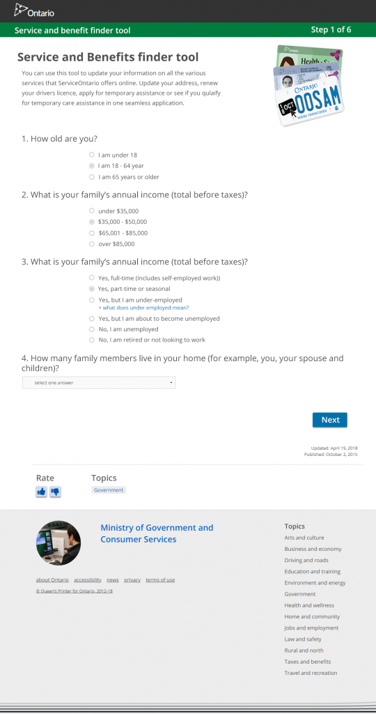
Step 1.
The user would answer 4 questions that would determine what services they would be eligible for. I added an accordion hint link, as it was better for accessibility. When clicked it opened and displayed the information. I improved the design by creating more whitespace between radio buttons and content within the page.
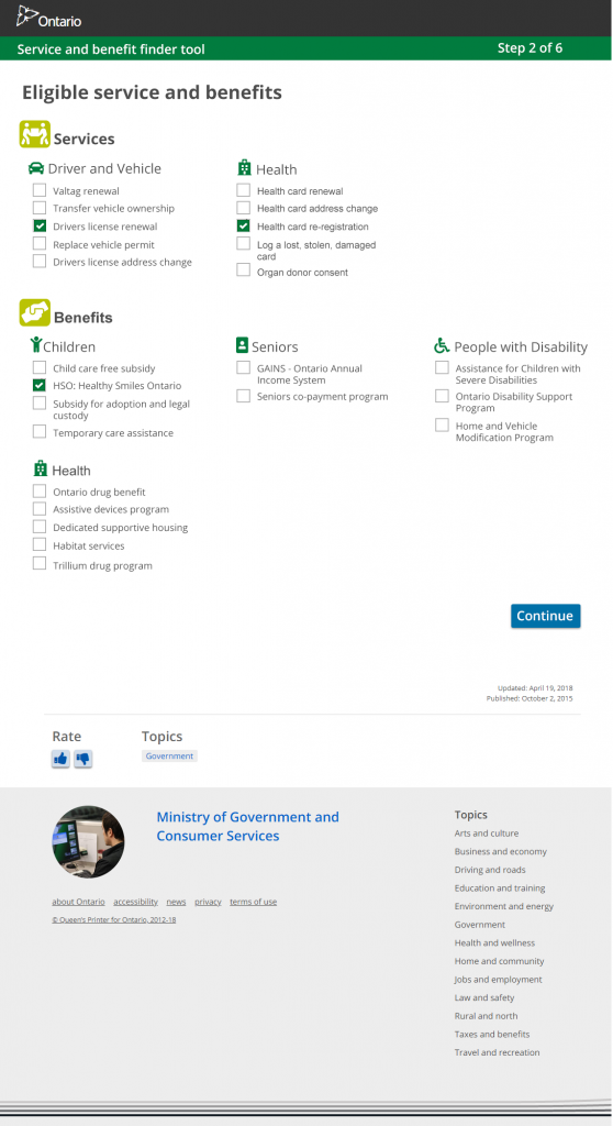
Step 2.
This page would display what services the user qualified for. All services were provided and simplified the whole process. The user could check off what they wanted and chose the continue button. I used customized check boxes so they were larger and easier to click.
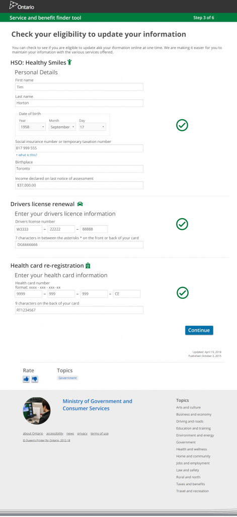
Step 3.
On the example mock up the user would fill in the appropriate information and receive a green check mark to confirm all data was correct. The date of birth form field was improved by using a select menu, rather than have the user type in the info.
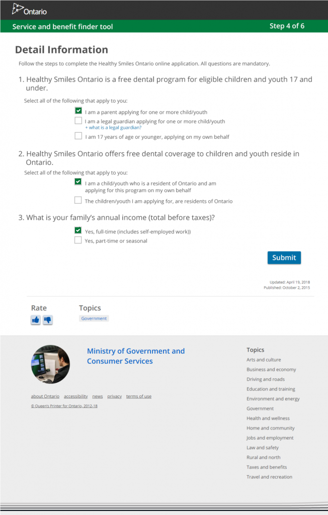
Step 4.
This step shows an example of the “Healthy Smiles”, a benefit that the user could apply for. It was simplified by allowing the user to only have to click check boxes and refrained from requiring any input text fields.
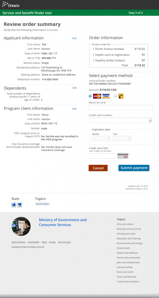
Step 5.
The original payment field was a 3 step (3 pages) procedure. I simplified it by having all the required information on 1 page. The program information, user data and credit card information all contained in one place, to make it a good user experience.
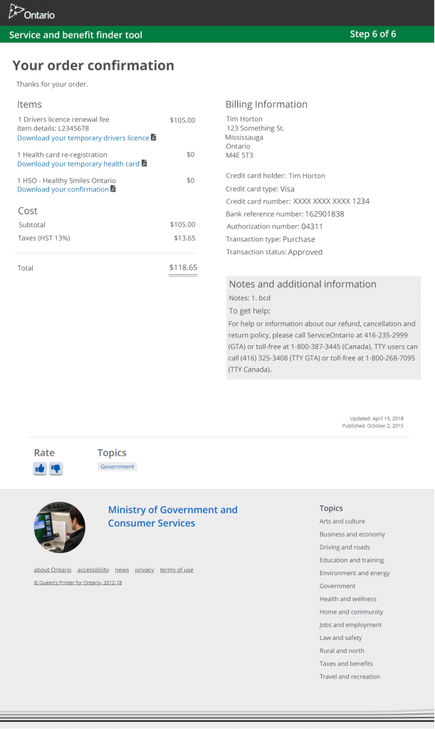
Step 6.
The confirmation page contained all the information from the order page and allowed the user to download their temporary drivers licence in pdf, so that they had it immediately. An email with the information would also be sent to the user.
The mock-up screens were well received as a solution to the current process. The hope is to build a prototype to test on users and then implement into production for the public to use.