Available Reports
The Ministry of Health PSRB (Payment Systems Registration Branch) internal facing applications were facing a great deal of issues. Not only were they not meeting AODA standards, they needed a usability assessment.
I was tasked with objective of making them AODA compliant but was facing some major issues. The original mandate was to update the HTML so that it would meet AODA standards. Unfortunately, the pages had to be completely overhauled and built using semantic HTML5 and utilize CSS to layout the pages. By doing so, they would validate in the W3C validator. Validated code is a major step toward semantic HTML and meeting WCAG 2.0 standards.
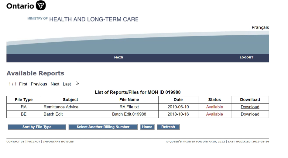
Available Reports Before
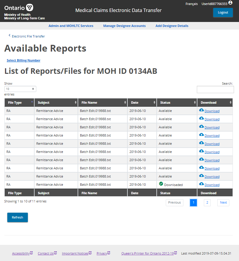
Available Reports After
Designing for usability was not taken into considertation when the application was built in 2008 (Yes, no updates since then). The tricky part is that it is an internal app, only used by afew individuals.In order to get the best feedback, I had to meet with the test subjects remotely via a phone call session. There were four people involved in the discovery session. The project manager who was familiar with the application and the two users, along with myself. From the session, we were able to surmise what changes needed to be made to improve the usability of the app. They are summarised here:
- Updated the header with an svg logo and logo name as text rather than part of image.
- Added skip to content in header, allowing user to bypass unnecessary links.
- User ID displays when logged in so that the user knows if they are logged in or out.
- Created logout button and standarised all buttons. Added it to the right of the header which improved accessibility.
- The links were moved from vertical left aligned, to a horizontal menu under the header. This improved the navigation and layout of the content.
- A breadcrumb was added to the top of content, for quicker access to the previous page.
- The typography was standardised for a consistent look and feel for all apps.
- Buttons were moved under the table and added links above the h3 for improved visibility.
- Added downloaded check mark icon and download icon improving visual ques for users
- Datatables were implemented to display data for added accessibility and better use of data sorting, pagination and search within the table.
- The footer links were standardised and an icon was included for opening external links in a new tab.
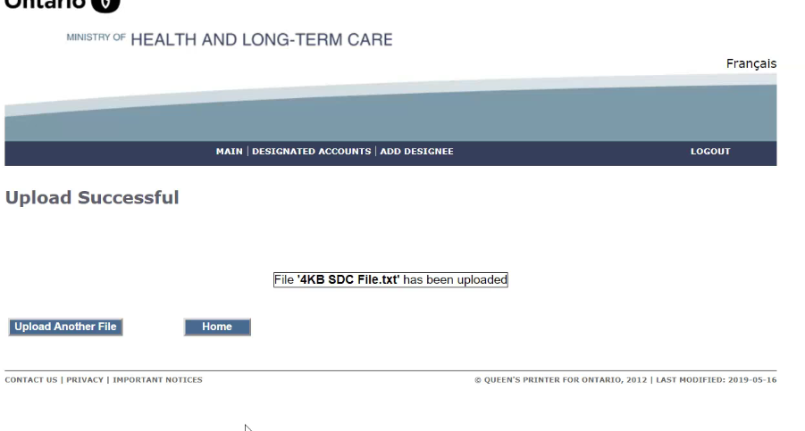
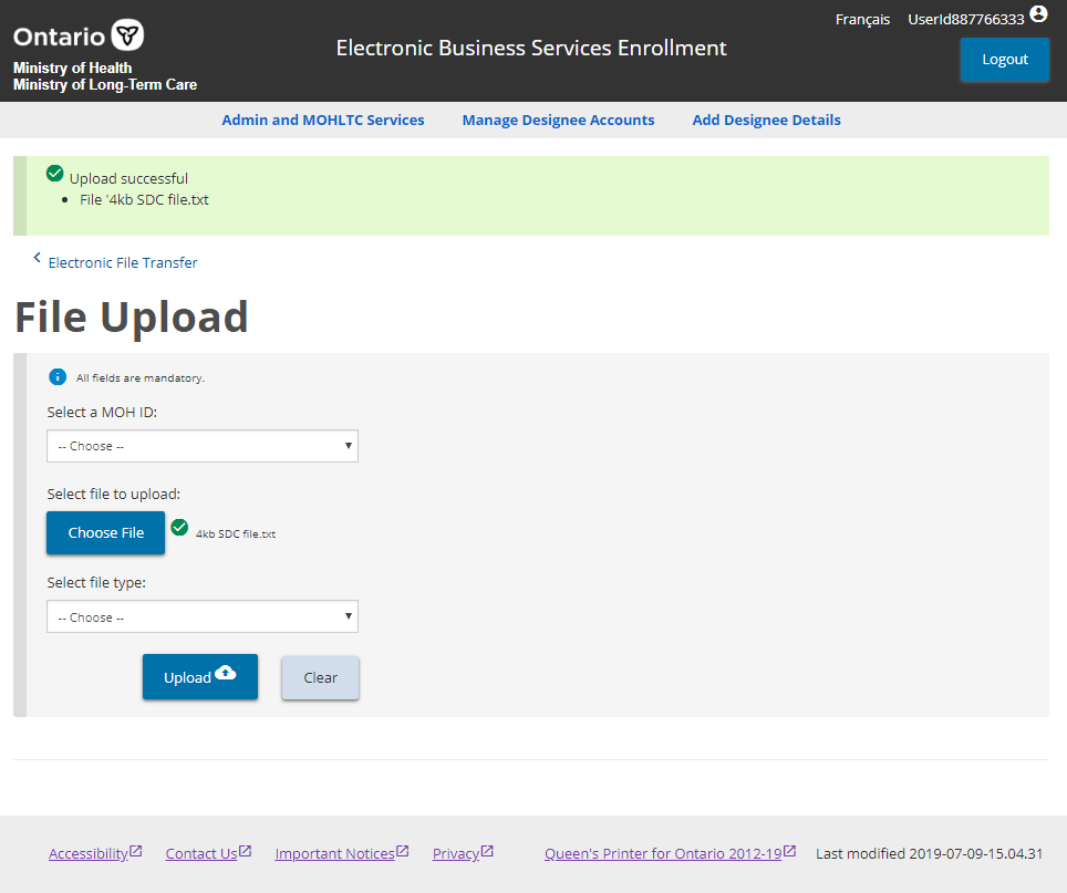
File Upload Success
The upload success page was not informative enough for users to know that their file had been uploaded. The following are decisions that were implemented to improve the user experience and effectiveness of the application:
File Upload Success Before
File Upload Success After
- The upload button was enlarged and styled as a primary button improving the standardised look and feel.
- Adding a green check mark beside the file was an improved visual que for the user.
- An obvious success alert with green background and checkmark appears at the top of the content. This was a big improvement over the previous version. It included a success message and the file name.
- The user is also offered a secondary “Clear” button if they wish to abort the upload process.
Upload Designate Permissions
This section was composed of two separate pages for upload and download. To simplify it I used a tabbed table so that one tab had the upload and the other download. It improved having to jump back from page to page simplifying the process.
Upload Designate Permissions Before
![]()
Upload Designate Permissions After
The data from the table was not laid out nicely and needed to be improved upon:
- Created a table with headings and columns so that the user could see what data related to which heading.
- Used improved styled check boxes with the standard blue color used in primary buttons. Larger checks were visually easier to see and using aria elements to improve the accessibility for screen reader users.
- Improved on the buttons utilising new styles and adding a “Remove all” button so that items could be unchecked all at once.

With the re-branding of the design look and feel, the user experience has increased dramatically. The markup changes allowed for meeting WCAG 2.0 requirements for users requiring screen readers. I created a design guide and template system, so that any new apps would all meet the standardised style requirements when building new apps or iterating existing designs.
Senior management were very happy with the finished product.