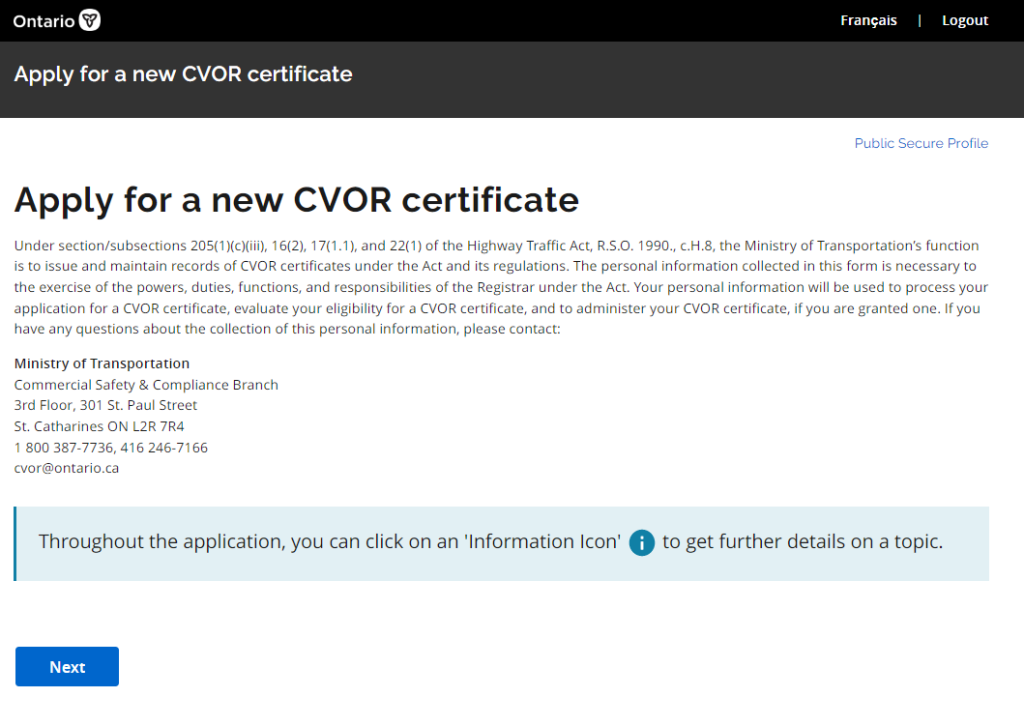
The trucking industry is a crucial component of the supply chain, and ensuring that all trucks are properly registered and maintained is essential for safety and efficiency. The previous truck registration process was time-consuming and confusing for truck drivers, leading to frustration and errors. Our team was tasked with redesigning the truck registration app to improve the user experience and streamline the process.
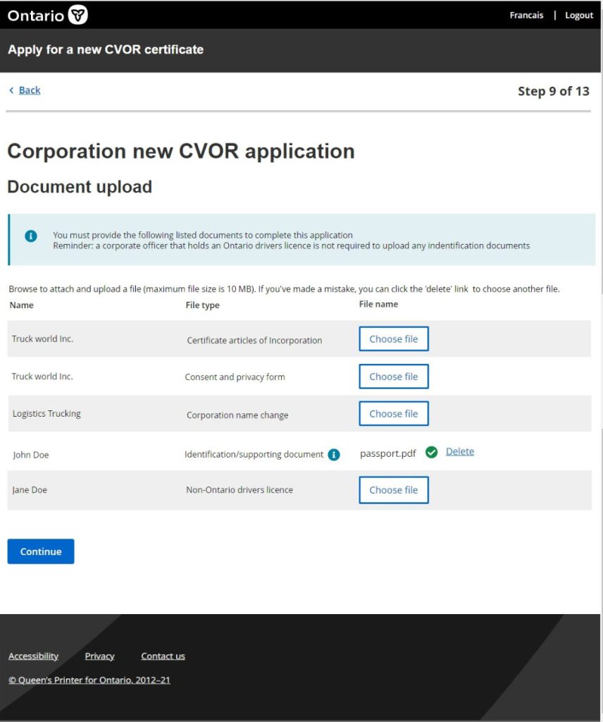
In addition to technical requirements, the redesign also needed to take into account the needs of stakeholders. A key goal was to reduce the volume of phone calls and interactions with the MTO helpdesk. Through user research, pain points were identified which highlighted the need for the app to be able to facilitate the uploading of documents and user onboarding. By streamlining these processes, it was anticipated that there would be fewer interactions with MTO staff, ultimately improving the user experience.
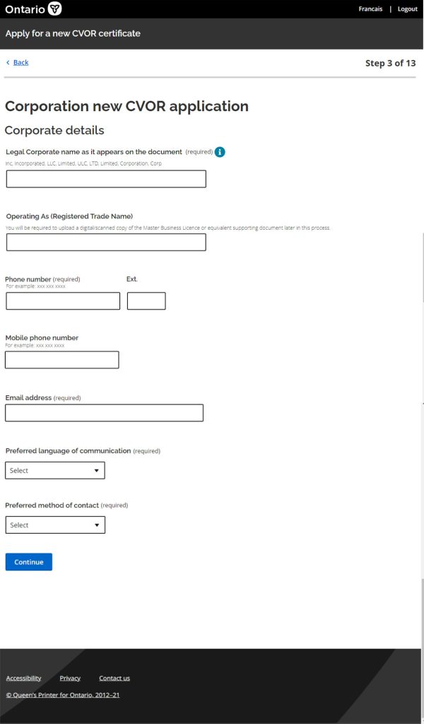
To understand the challenges faced by truck drivers during the registration process, we conducted user interviews. We also observed truck drivers during usability sessions as they attempted to complete the registration process using the existing app. Our research revealed that the current app had a confusing interface, a large number of legacy required fields that needed to be removed, fields that weren’t required that also needed to be removed, and a lack of clear instructions. Many of the fields had been transferred to the online application from the outdated print form and included input fields for fax number and other unnecessary data requirements.
We used the ODS design system in order to adhere to design guidelines set out for all OPS websites. Based on usability testing, It was clear the wording needed to be improved so that the onboarding of the user to the app would provide fewer pain points . This included adding hint text to certain fields and adding hint expanders for improved usability. We also streamlined the interface to reduce the number of required fields and made the app more visually appealing with larger text and graphics including call outs with extra information for areas within the application we identified as pain points for users.
Improved User Experience: The updated app now provides truck drivers with a clear and straightforward registration process. By adhering to design basics like increasing white space, using vertically aligned form fields and concise labels, help guide them through each step. The streamlined interface and larger text make the app more accessible for truck drivers who may have difficulty reading small text on a screen.
The updated truck registration app has received positive feedback from truck drivers and has reduced the number of errors in the registration process. The improved user experience has also led to increased user satisfaction and has saved truck drivers time and effort during the registration process.
It’s convenient to be able to fill this out online. It saves from having to go to ServiceOntario.
Edward
Our team’s redesign of the truck registration app has improved the user experience and streamlined the process for truck drivers as well as cutting down on interactions with helpdesk employees. By incorporating the insights from our UX research and utilizing a new design system, we have created a more efficient and user-friendly app that benefits truck drivers and stakeholders.
